
Of course, colors never look quite the same in photographs or on monitors as they do in real life, but we wanted to give everyone a sneak peek.

The carpet choice seen here is representative of what will be throughout most of the upper level. There will be slight variations in the pattern in different areas of the building, but the colors will remain the same. If you've seen The Reading Room/library staff temporary office since it was completed, this color scheme is an extension of the choices there.

Don't panic; the orange, yellow, and blue will be for "accent walls" and will probably be paired with the "transitional" french vanilla color at the top of the picture below. The combination looks much better than this scattering might lead you to believe!

The oak for the doors is very close to what has been in Reeves Hall up to this point.

The burgundy baseboards blend very well with the carpet tiles.
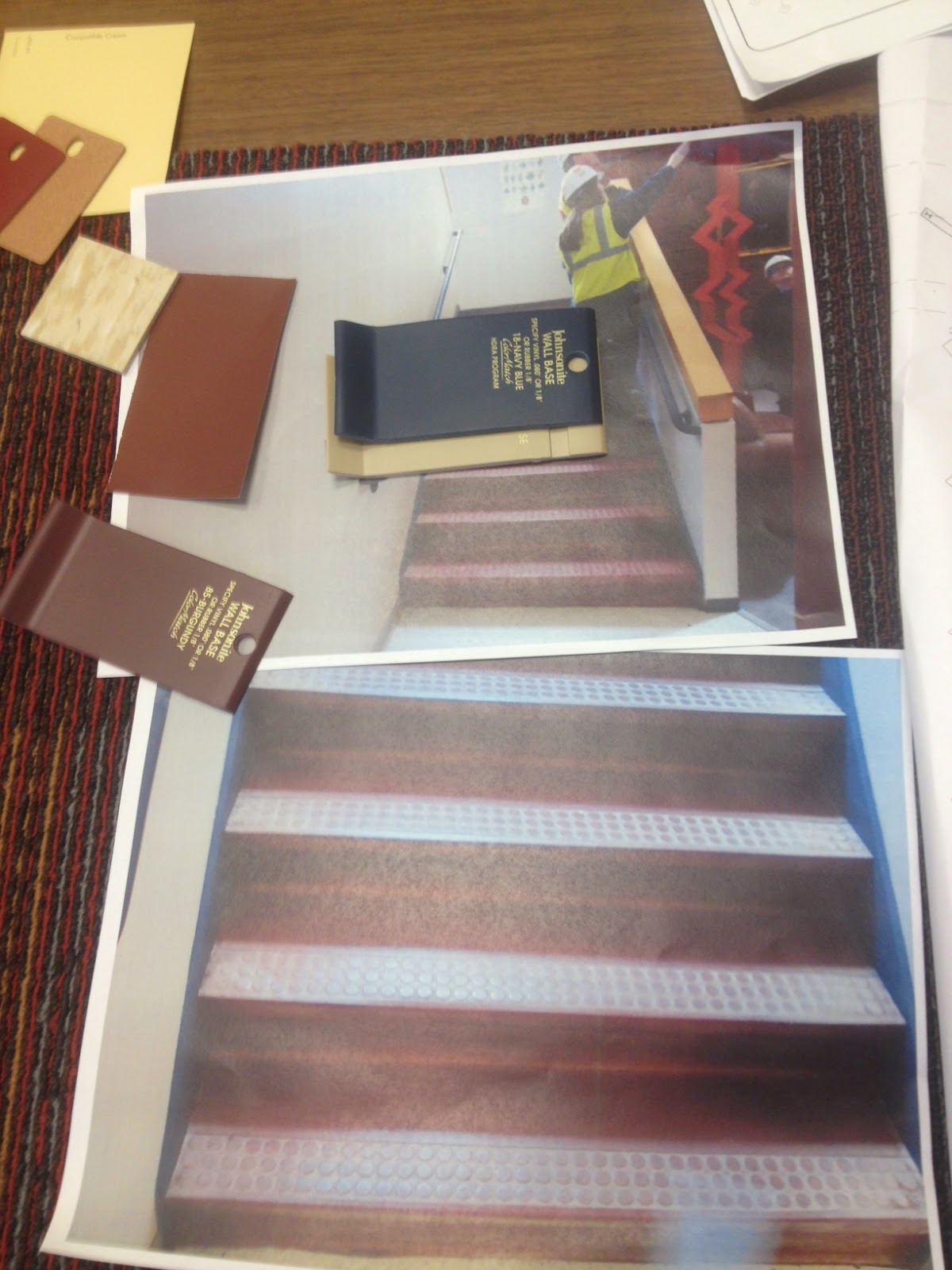
These colors don't come through as well in this shot, but the blue and cream vinyl chips in the top center of this shot are planned for the stairways. They'll replace the existing worn-out maroon. Safety considerations require having a contrast strip to make the treads more visible.
We can't wait to get a glimpse of possible furniture! "Soon" is the word. :)
So glad that they are considering those of us with low vision. When going down stairs that are one solid color, the edges are nearly invisible to me.
ReplyDelete